01 · Mobile Application · Ride Booking
WeCab
Designing a Faster, Safer & More Reliable Ride Booking Experience
- Domain
- Passenger mobility app
- Role
- Product design, UX direction
- Team
- Team project
- Duration
- 4 weeks
- Status
- Concept / design system
Overview
A ride-booking experience built around confidence and speed.
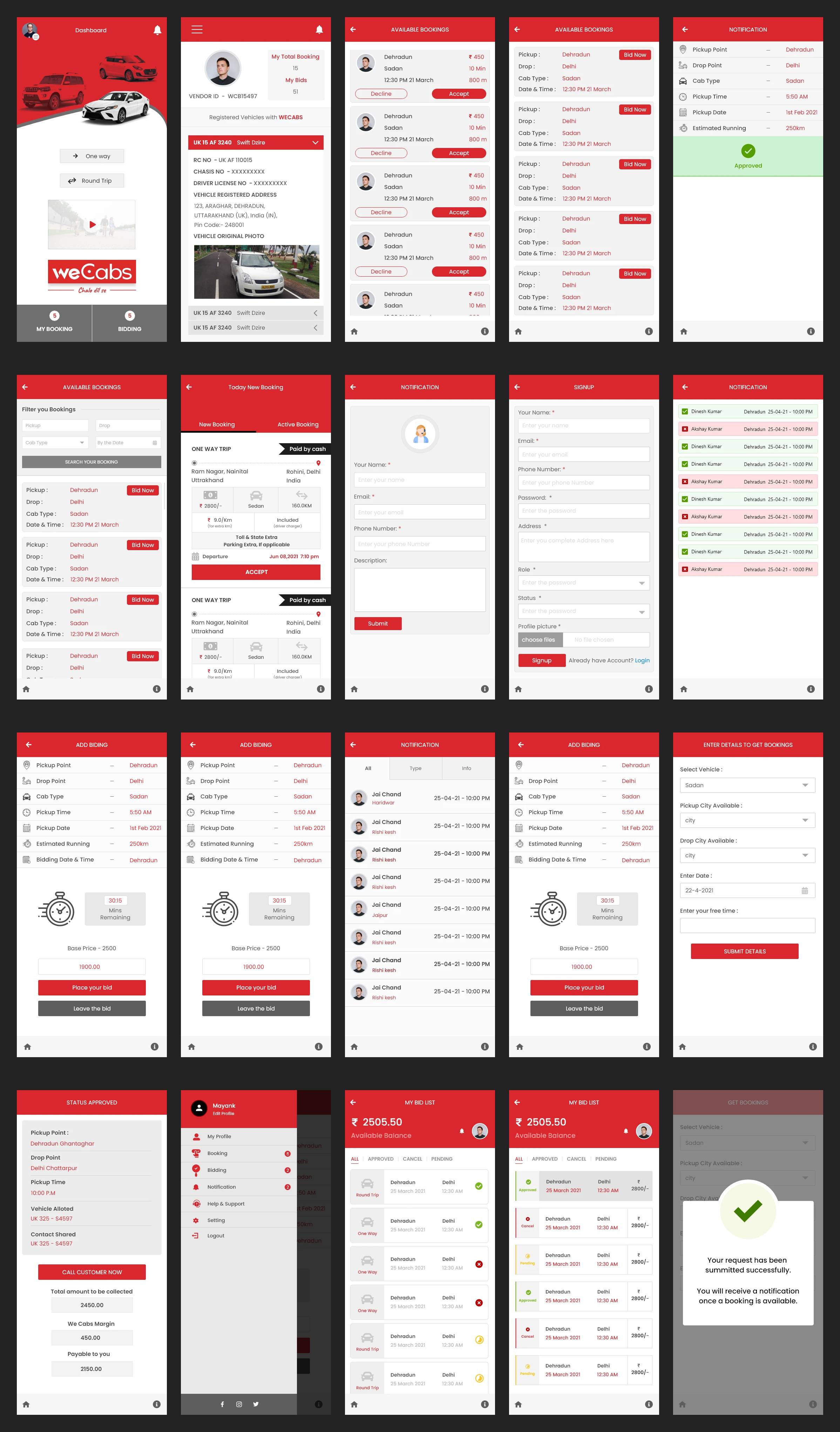
WeCab is a ride-hailing platform that helps passengers quickly book rides while providing drivers with an efficient way to manage trips. The objective was to redesign the booking experience, reduce booking friction, improve driver-passenger communication, and increase booking completion.
The challenge
Fast decisions in a high-anxiety journey.
Booking hesitation
Customers often hesitate when pricing, ETA, and driver signals are unclear or spread across too many screens.
Trust gaps
Commuters need visible reassurance that the trip is reliable, the car is on the way, and the booking is proceeding as expected.
Design approach
Reduce cognitive load and make every tap feel decisive.
Primary goal: help users complete their trip request quickly without losing clarity or confidence.
Design principles: fewer screens, bold hierarchy, direct action paths, status visibility, and reassuring microcopy.
The interaction experience was designed to make pricing, timing, and progress feel understandable at a glance so users can act without second-guessing.
Solution
A clean booking flow with high-trust information architecture.
One-screen clarity
The booking entry flow keeps destination, fare cues, and action buttons visually close so users don’t have to hunt for the next step.
Status-first confirmation
Driver status, ETA, and a steady visual cadence reinforce trust during the critical request and waiting states.
Impact
A compact mobile app concept tuned for real-world decision-making.
This concept demonstrates how a mobility product can stay lightweight while still providing the reassurance users need before they place a booking.
The design balances speed, legibility, and trust—three ingredients that matter most in a time-sensitive mobile flow.
Key takeaways
1. Clarity beats extra detail. Making primary state, fare, and progress visible at a glance reduces hesitation.
2. Trust is a UX outcome. Clean confirmations and meaningful status cues make the app feel dependable.
3. Mobile success depends on focus. A strong single-purpose journey wins over excessive screens and optional actions.
Next case study
Studio99
A mobile-first studio booking experience shaped around discoverability, trust, and conversion.