02 · Mobile Application · Studio Discovery
Studio99
Building a Connected Fitness Experience Beyond the Gym
- Domain
- Studio booking / discovery app
- Role
- UX/UI design, product concept
- Team
- Team project
- Duration
- 3 weeks
- Status
- Concept / prototype
Overview
A discovery-first mobile app that shifts users from browsing to booking faster.
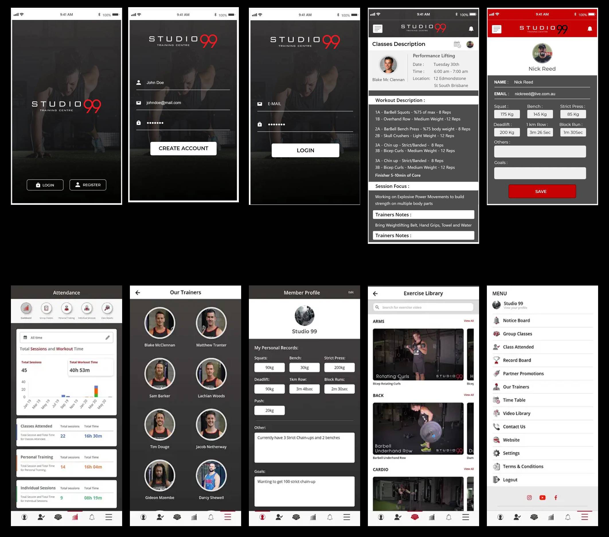
Studio99 is a premium fitness training centre that wanted to create a digital companion for its members. The objective was to extend the gym experience beyond physical sessions by providing workout plans, trainer communication, attendance tracking, exercise tutorials, and personal performance records—all within a single mobile application. The application aimed to improve member engagement, reduce administrative work for trainers, and motivate users to stay consistent with their fitness goals.
Design Challenge
The Problem
Gym members relied heavily on trainers for workout instructions and progress updates. Important information such as attendance, exercise demonstrations, and personal records was scattered across different channels or managed manually.
Difficulty remembering workout routines
Limited visibility into personal progress
Lack of motivation outside training sessions
Increased trainer workload for answering repetitive questions
No centralized platform for gym communication
The solution
A visual discovery flow designed to surface the right booking intent quickly.
Visual-first discovery
Strong imagery and consistent card structure make each option easy to scan, compare, and explore.
Booking trust cues
Availability, category fit, and a clear primary CTA help users convert without uncertainty.
Outcome
An app concept that feels premium, approachable, and intentionally guided.
The final experience is designed to minimise browse fatigue and support confident action in a secure, polished mobile context.
It demonstrates how mobile discovery screens can present a lot of latent value without sacrificing clarity or the quality of the user prompt.
Key takeaways
1. Strong visuals increase confidence. When users can understand the offering quickly, they are more likely to explore deeper.
2. Comparison works when hierarchy is clean. One prominent visual + one clear CTA reduces ambiguity.
3. Discovery should always lead toward action. The best browsing experiences never lose sight of the final step.
Next case study
WeCab
A ride-booking experience focused on speed, trust, and confident decision-making.