05 · HealthTech · Genomics Website
Genomics For Life
Modernising a genomic pathology website to make complex testing information easy to understand for patients and clinicians.
- Domain
- genomicsforlife.com ↗
- Role
- Lead UX Designer
- Team
- Team project
- Duration
- 4 weeks
- Status
- Completed
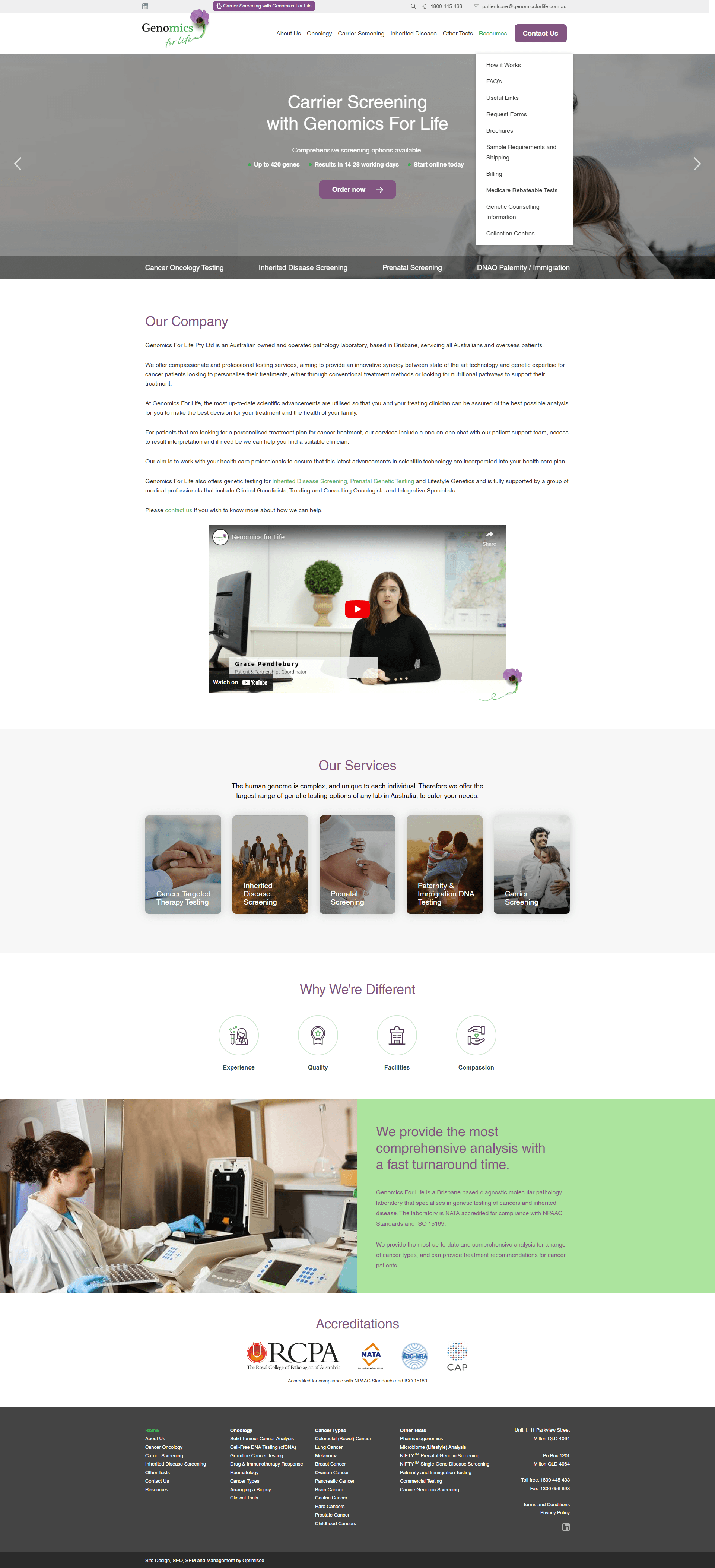
Project visuals
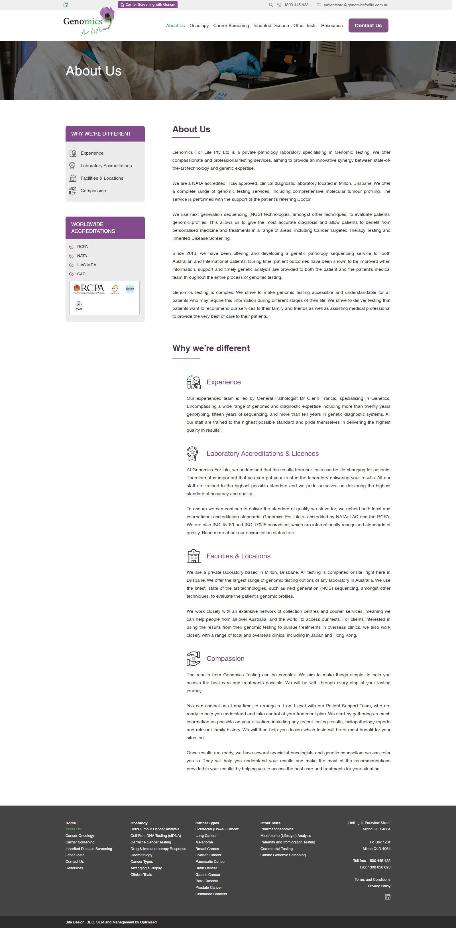
Overview
Modernising a genomic pathology website for patients, clinicians, and referral partners.
Genomics For Life is an Australian diagnostic molecular pathology laboratory specialising in genetic testing for cancer and inherited diseases. The organisation provides advanced genomic testing services for clinicians, hospitals, and patients while emphasising scientific accuracy, trust, and fast turnaround times.
The laboratory is NATA accredited and complies with ISO 15189 standards. The objective of the redesign was to modernise the digital experience while making complex genomic information easier to understand for patients, healthcare professionals, and referral partners.
The challenge
A trusted laboratory with an online experience that felt too complex and outdated.
Traditional healthcare design
The website felt conservative and failed to create a premium, approachable healthcare experience.
Dense medical language
Complex genomic terminology made it hard for patients to understand the testing process and outcomes.
Navigation friction
Key resources required multiple clicks, making it difficult for clinicians and referrers to access information quickly.
User research
Research identified three primary users with distinct needs: oncologists, patients, and healthcare providers. Each group needed faster access to information, more clarity, and stronger digital trust.
Oncologists
Needs: find testing services quickly, understand available panels, download referral forms, and contact the lab.
Pain points: too many clicks, difficult service comparison.
Patients
Needs: understand genomic testing, learn the process, feel confident, and contact support.
Pain points: overwhelming medical language, unclear testing journey.
Healthcare providers
Needs: view available testing, access documentation, and contact specialists.
Pain points: important resources were hard to locate.
Problem statement
How might we simplify complex genomic information into an intuitive digital experience that builds trust, educates patients, and helps clinicians quickly access diagnostic services?
UX goals
- Improve information clarity
- Increase trust
- Reduce navigation complexity
- Improve accessibility
- Create premium healthcare branding
- Improve enquiry conversion
Design strategy
1. Simplicity
Reduce cognitive overload and present one message per section.
2. Trust
Use accreditation, lab imagery, statistics, and clinical credibility to establish confidence.
3. Education
Break complex genomic concepts into simple visual explanations and make the testing process easy to understand.
The solution
A clearer, more confident website structure built for clinical and patient audiences.
1. Clarified content hierarchy
I redesigned service pages and navigation so users can find tests, referral forms, and support in fewer clicks.
2. Built trust through transparency
Accreditations, lab credentials, and scientific visuals were surfaced more prominently to validate the lab’s reliability.
3. Simplified complex concepts
Medical language was broken into digestible sections with clear labels, patient-focused explanations, and visual cues that make genomic testing easier to understand.
The impact
The redesign made genomic diagnostics feel more approachable, credible, and actionable.
Accreditation clarity — NATA and ISO credentials were made immediately visible to reassure clinical audiences.
Reduced complexity — Key genomic information became easier to scan for both patients and professionals.
Faster access — Critical resources and referral forms were easier to locate, reducing navigation friction.
Key lessons
Designing for scientific accuracy without sacrificing accessibility.
1. Trust must be visible immediately — Accreditation and clinical credibility should appear at the top of the page, not buried in footers.
2. Simplicity is critical for medical content — Breaking the content into steps and visuals makes dense information feel manageable.
3. The experience should support multiple audiences — Patient and clinician needs can coexist when the site is structured around clear information pathways.