07 · BioTech
DNAQ
A science-led digital presentation built to communicate identity, precision, and trust.
- Domain
- DNAQ
- Role
- End-to-end UX, IA overhaul, wizard design
- Team
- Team
- Duration
- 30 Days
- Status
- Completed
Project details
Overview
Redesigning a healthcare brand for clarity and trust.
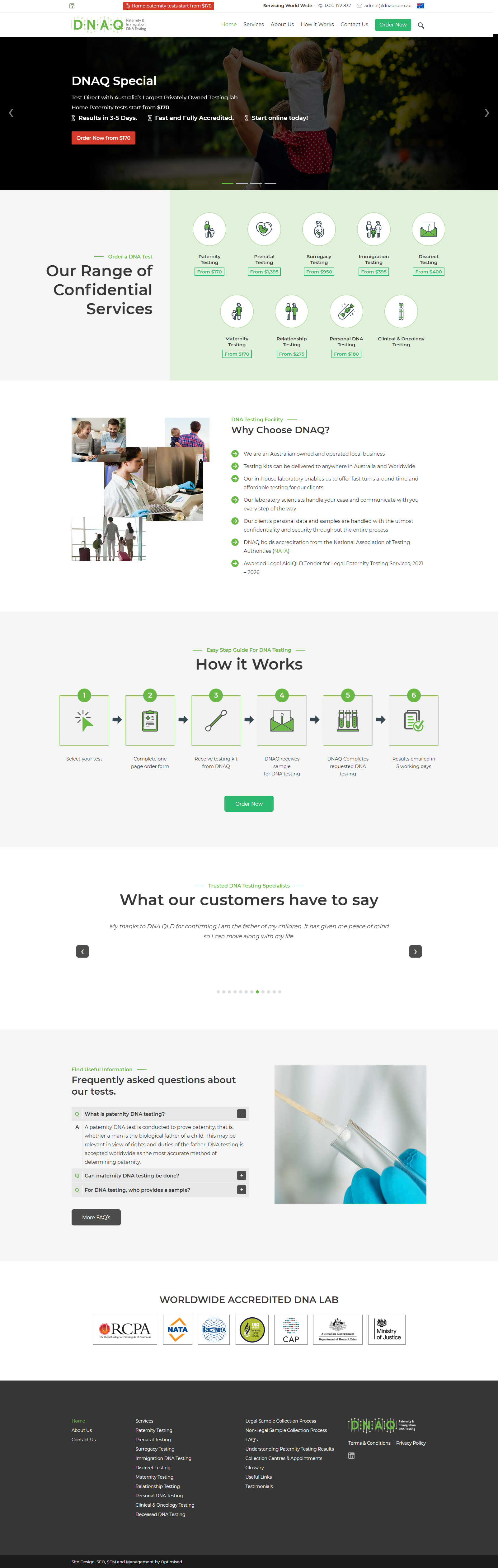
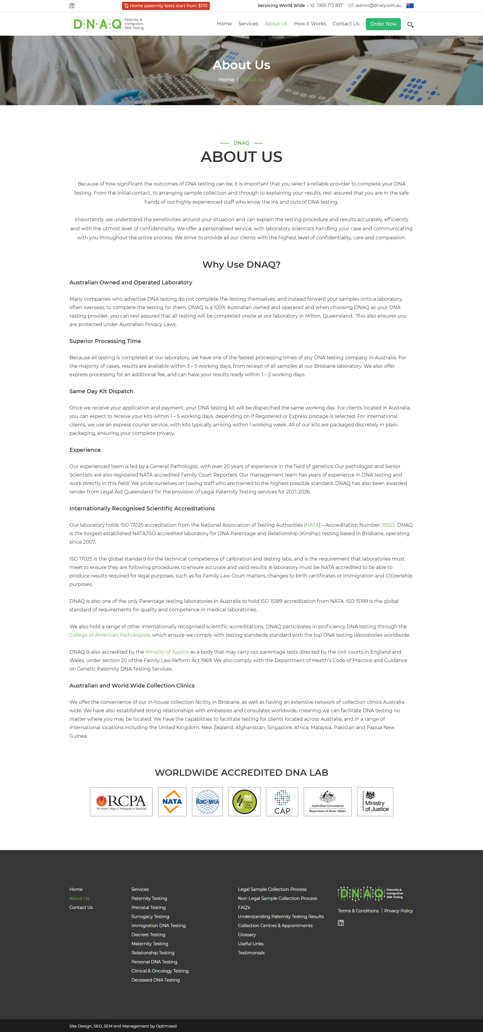
DNAQ is an Australian healthcare company specializing in DNA testing and genetic screening services. The existing website contained valuable medical information but presented significant usability challenges that deterred users from booking tests.
The redesign focused on a core insight: healthcare users need clarity and reassurance before making medical decisions. By simplifying complex medical information, improving navigation, and building visual trust signals, we created a modern experience that encourages conversion while maintaining scientific accuracy.
Project Type: Healthcare Website Design | Duration: 4–6 Weeks | Deliverables: UX Research, IA, Wireframes, UI Design, Design System
The challenge
Dense content, unclear services, weak conversions.
The existing website suffered from several critical usability issues:
- Content Density: Dense blocks of text reduced readability and user engagement.
- Poor Service Discoverability: DNA testing services were buried in navigation, making it difficult for users to understand available options.
- Weak Information Hierarchy: No clear visual distinction between important information and supplementary content.
- Inconsistent CTAs: Calls-to-action were scattered and didn't stand out, reducing appointment bookings.
- Limited Trust Signals: The visual design didn't communicate the credibility and professionalism expected from a healthcare brand.
- Mobile Experience: Responsive design was limited, impacting the growing mobile user base seeking healthcare services on-the-go.
Project goal
Build trust. Simplify complexity. Increase conversions.
Key Objectives
- Build trust through professional healthcare branding
- Simplify complex medical information
- Improve service discoverability
- Encourage appointment bookings
- Create a scalable design system
- Ensure full accessibility (WCAG-compliant)
Design Principles
- Trust: Professional, consistent visual language
- Clarity: Simple hierarchy, readable typography
- Accessibility: Large touch targets, high contrast
- Conversion: Clear CTAs throughout customer journey
Discovery phase
Research, benchmarking, and insights.
Research Activities
Website audit, competitor analysis, UX heuristic evaluation, and content review across Australian healthcare providers, genetic testing companies, diagnostic laboratories, and medical booking platforms.
Key Findings
- Clarity Drives Decisions: Healthcare users need clear, jargon-free explanations before committing to medical decisions.
- Trust Indicators Matter: Certifications, testimonials, and professional design significantly influence conversion rates.
- Simplicity Over Jargon: Users prefer concise, plain-English explanations over technical terminology.
- Mobile-First Behavior: Over 60% of healthcare research happens on mobile devices; responsive design is non-negotiable.
User research
Three primary user groups.
Patients
Looking for reliable genetic testing information before making healthcare decisions.
Needs: Understand tests, learn process, verify credibility
Families
Seeking hereditary disease screening for family health.
Needs: Reassurance, clear explanations, easy booking
Healthcare Professionals
Searching for clinical information and referral services.
Needs: Clinical detail, referral options, contact info
Design challenge
Balancing accuracy with accessibility.
The biggest challenge was communicating complex healthcare and genetic information without overwhelming users. Medical terminology can trigger anxiety in patients, while oversimplifying risks losing scientific credibility with healthcare professionals.
The solution required a layered approach: professional visual branding to establish trust, progressive disclosure to reveal complexity only when needed, and plain-English explanations paired with technical details for different user personas.